Improvement Project 2
Responsive Website Redesign
The Challenge
Note: This project showcases before and after website designs. Screenshots demonstrate the improvements made.
This project involved redesigning a blog website built with PHP and CSS. The initial version had no responsive design.
Feedback Received:
- Website breaks on mobile and tablet devices
- Navigation menu not user-friendly on smaller screens
- Font sizes inconsistent across pages
- Gallery area's not working anymore
Visual Comparison
Before
Original Design
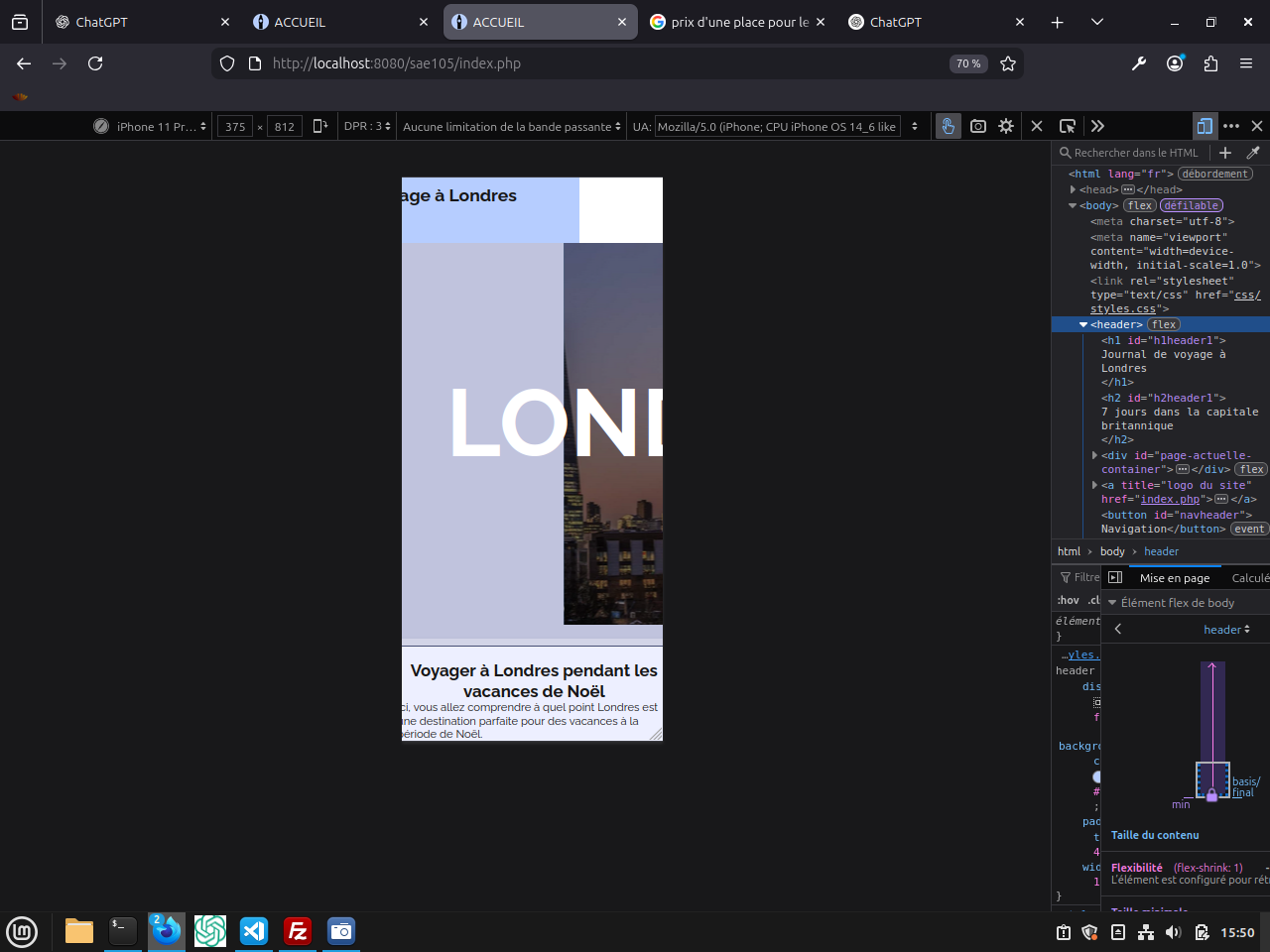
Not responsive design
After
Improved Design
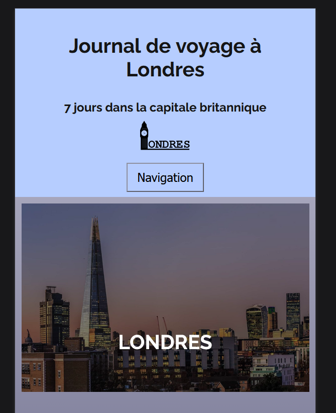
Fully responsive for all devices.
Key Improvements
- → Mobile-first responsive design using CSS Grid and Flexbox
- → Hamburger menu for mobile navigation with smooth transitions
- → Consistent typography and improved readability